

From IMITATE to FAS
THE TRANSFORMATION OF WEB APPLICATION
My role as a designer was to redesign the current version of the web application IMITATE for another use for the military. This new system was retitled FAS, Field Assessment System. The task was to reduce some of the tabs, making them more straightforward to use, and less error-proof. The client desired a more elegant, straightforward, clean look interface which reflects more of the military branch
The client was a military operation using this app to assess personnel in the field. We asked the clients what changes and needs they would like to see in this new version of this app. The main concepts were clean, modern, professional, easier to use, and off-line versions when Wifi is unavailable. We assessed the previous designs below.

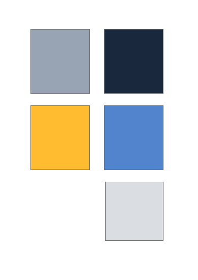
Selecting a color palette
We selected to tone down the more vibrant colors and started looking at different colors which align with their needs


Applying the color and reworking the design
We worked on apple the color and adding a fluid look to the login page. We incorpiratetd a circular design, with a glass look to give it a more modern feel. Leaving white space also gives them a clean look.
DESIGN 1
Here we applied the first color palette, with the exception of the cards. Technically we ran into software development issues. Because of the colors we “hardwired” on the back end of coding. We were not able to change through the usual CSS. We worked around it by adding an overlay of dark over the current colors, to tone down the vibrance.

DESIGN 2
Here we applied the third color palette, except for the cards. This color scheme gave a robust military look.


