

Department of Energy
CASE STUDY OF A GOVERNMENT WEBSITE
We sought to make the website more friendly for users. We analyzed the website to see where we can improve a user’s experience and better understand the Department of Energy’s purpose and how they use the information.
Roles & Responsibilities:
User Research (Interviews + Surveys) • Usability Testing • Heuristic Evaluation • Interaction Design • Prototyping • UI Design Analysis • Site Mapping
Building a Persona
The Department of Energy website has various information from artificial intelligence, environmental issues, and STEM Programs. After my team and I viewed the website, we build a proto persona based on the categories we could relate most to in our daily lives. Here we came up this Caitlin Ryan.

User Testing Plan
From here, we developed a testing plan. Our objective is to find educational information and resources to enhance the user experience by conducting tests. We planned to interview 3-5 users on Energy.gov and observe them complete various tasks on the website.
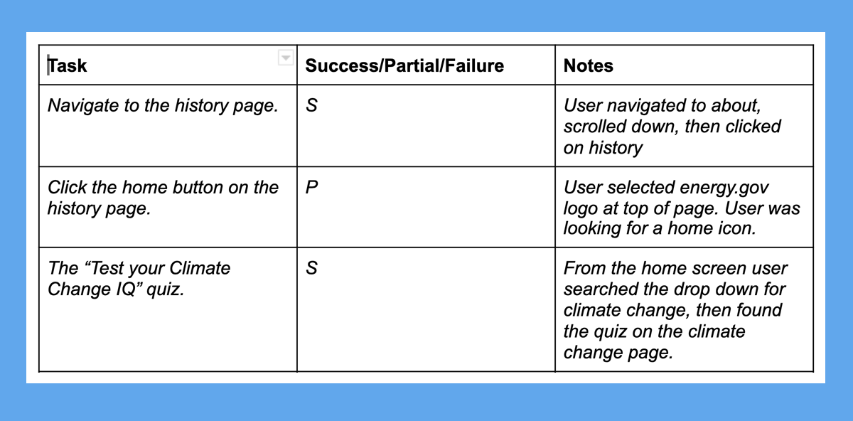
The Tasks
These are the task we asked our users to walk through the homepage. This method helps us understand how they used the website. We observed them as performed these tasks as well as get feedback from them.
The Results
After user testing, we asked our participants what they thought of the website. We asked what they liked, dislike, and what doesn’t make sense about the website.

Annotations of the Homepage
We then look deeper dive into the website itself. Our team discovered a few areas that could use improvement.

Camouflage Text
On many pages on this website, the text on the hero images was hard to read. Thinking there must be a better way to separate the text from the background to make it readable.

Lonely Icon
The Icon for the “Save Energy, Save Money” seemed inconsistent with the rest of the categories.

Only a few articles have images
The website uses a pattern background for the articles without images. When looking at it all together looks inconsistent with the articles with photos.
Restructure of the Homepage Navigation
We moved the category from the top website to the main navigation bar. We found many users wanted to learn more about what the Department of Energy is about and its history. We revised this in our navigation to reflect our research.

Homepage Design and Testing
From our card sorting, we started laying out the beginning re-design of the website. Laying out all the categories and prototyping how well they would work with the website. Then we also started working on changes to the header and the footer in the mobile versions.


Dark or Light Mode?
Looking at color palettes and our inspiration board, we explored different styles. We started with a dark mode to create something different, and it felt too much of a departure from the original website. In the end, we went with a light mode. This version kept with the government look of the original website.

Final Design
Here is our final design. It incorporates the feedback from users we received. We made the navigation bar less cluttered and cleaner. In the hero image, we added a text box to separate the text from the background image. The hierarchy of the categories is more apparent, keeping the “Top Stories” the main priority, having a photo for each of the articles, giving the website a consistent look. We feel this re-design is cleaner and better to navigate, making this a better experience for all users.

