

Dolphins Plus
WEBSITE & MOBILE APPLICATION DESIGN
Dolphins Plus is an attraction located in the Florida Keys. It offers visitors a one-of-a-kind swimming experience with dolphins. The gift shop website in need of a redesign. Here is how my team helped make this mobile website better.
Roles & Responsibilities:
User Research (Interviews + Surveys) • Survey Research • UI navigation • Card Sorting • Prototyping • Presentation
Current Website
Here is the current site. As you can see, it has a variety of issues that need to be addressed, from unreadable muddled marketing info in the hero image, out-of-stock items, broken links to non-responsive images. So, we decided to redesigned this website, so visitors could purchase souvenirs and find the one unique to their experience. Thus, making it a clear, structure, and enjoyable experience from beginning to end.

Desktop
Once you look at the desktop website, it gives you a variety of items to purchase. Unfortunately, the random group of items displayed has no common theme. This layout is making it confusing to understand why these souvenirs are prominent.

Mobile
When we looked at this website on mobile, the hero image doesn’t resize, and the main message cuts off, making it look odd and out of place.
Defining the Problem
The Dolphins Plus gift shop website is unorganized, unstructured, and under-stocked. By redesigning, the website will better highlight the unique, one-of-a-kind gifts they have to offer and increased revenue, and the user feels it’s part of the Dolphins Plus main website.

With user testing and surveys of over 40 participants, we narrowed the issues with the website to critical problems. From here, we have a clear blueprint for re-design.
Restructuring Navigation
The original navigation was vague, and it seemed that the souvenirs were placed in different categories. For example, some souvenirs could only be found under the “shop all” category. Then we got specific and created categories for everything. Which then led us to our final navigation.

We wanted to keep it simple and easy to use while providing users with enough categories to find what they were looking for, our decisions were based on the inventory of dolphins plus gift shop. This was to keep the number of categories manageable size, not to overwhelm the user.

Once we finished organizing the navigation, we were ready to start the prototyping phase.
Sketching to Prototyping
We wanted to focus on the mobile-first because it needed a lot of help and because if we could make the mobile version cleaner, we certainly could do the same to a desktop version. So first, we sketched an idea of what we wanted the mobile site to look like, and then we moved to Figma to start the low fidelity prototype. We created a responsive header and organized the pages to give them a cleaner and more organized look when sized down from the desktop version.

High Fidelity Design
Here we came up with the high fidelity design. We used Figma to create this mobile application and animate the key features. Here is a walk-through of selecting an item to confirmed payment.

Feedback & Changes
Banner Changes

Some user feedback that we received was that the original banner was challenging to read the logo on and didn't indicate where the user was. So we added the darker gradient and the words "gift shop" so the user knew where they were..
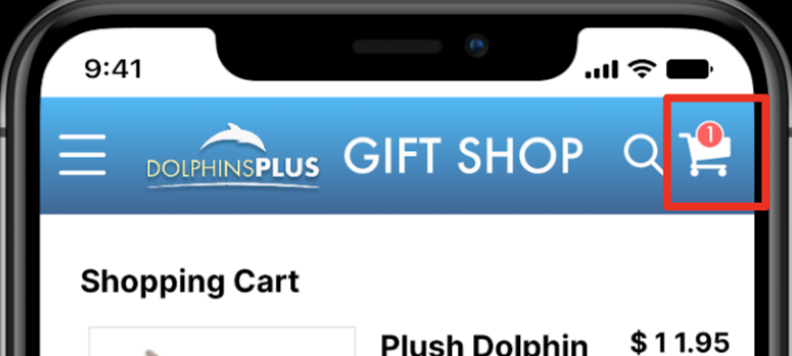
After the user testing, some other small iterations were to add an icon to the shopping cart informing the user that there is an item in their basket.
Confirmation Color

To keep in the website's theme with the blues, we originally had a blue checkmark to confirm the payment. However, user feedback led us to change it to green to indicate the success of a purchase.
Email Confirmation

Added the "email confirmation" text, so the user was made aware of the following steps after making their purchase.
Final Design
Adding the changes to design, here is the revised process of the mobile application from adding to the cart and checking out. In addition, we featured the most commonly purchased souvenirs from our surveys.

In Conclusion
Redesign of the Dolphins Plus Bayside responsive mobile site for the gift shop. The objective is to have an intuitive way for users to navigate the gift shop page for various souvenirs and unique gifts. It now offers better organization, a cleaner look and makes the user feel as though they are in an extension of the main Dolphins Plus website.
Future Steps
The next step would be to transferring the design from mobile to desktop, keeping the same look and highlighting the custom dolphins’ souvenirs. Thus, making Dolphins Plus an enjoyable experience on any platform.
